
CSS Grid vs Flexbox for modern web layouts
Last Modified:
Understanting Flexbox and Grid concepts.
Just before Flexbox and CSS Grid, I used to apply workarounds using "floats" (a CSS property originally designed for wrapping text around images). There was a significant time and effort to make websites look right. Flexbox and CSS Grid finally gave developers much more capability to create modern and responsive layouts.
Understanding the Flexbox Concept: The One-Directional Dimension
Flexbox (Flexible Box) is a one-dimensional layout system. Flexbox works organising components vertically OR horizontally on a web page. For example, a real example is organising books on a shelf in a line. Left-to-right in a row or top-to-bottom in one direction. That's the way Flexbox works, aligning components on a page.
Flexbox is commonly used in navigation bars, buttons, and groups; aligning a profile picture next to someone's name; centring content vertically or horizontally; or any time items need to flow in a single direction.
If you want to have items centralised horizontally, you can simply tell the container and display:flex then apply justify-content: center italign-items: center for vertical centring.
Another main problem before Flexbox was the uneven spacing; when resizing a web page, the layout structure would be broken because of paddings and margins everywhere. Flexbox solved this problem.
Understanding the CSS Grid Concept: The Two-Direction Dimension
CSS Grid is a two-dimensional layout system. The CSS Grid controls both rows and columns simultaneously. For instance, imagine trying to arrange furniture in your living room, placing them in specific spots across multiple rows and columns at the same time. The CSS Grid allows you to define rows and columns once, then place items into the grid cells.
CSS Grid is used on the overall page layout, like the header, sidebar, main content, and footer. Grid defines the entire layout structure in just a few lines, positioning each section exactly where you want it without hacks.
Before Grid, developers had to work with precise float positioning. It was a nightmare working with nested containers to build a complex two-dimensional layout. Especially for responsive layouts, in case of components need to adjust automatically to different screen sizes.
Hybrid Approach: CSS Grid and Flexbox together
Both CSS layout tools are fundamental to creating professional websites today. You don't have to choose just one; you can use both together. CSS Grid is for layout, whereas Flexbox is for alignment.
For me, understanding Grid and Flexbox is organising components on the page that works beautifully on phones, tablets, and desktops. Applying both, you have more control over how components behave on a page with much less headaches and hacks in the past.
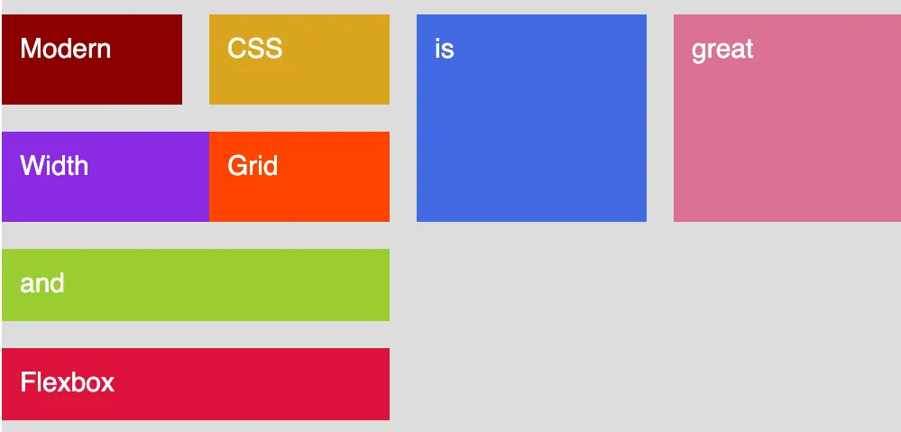
Grid-Flexbox created by the author
You can find a complete, reliable guide on the MDN Mozilla developer website.